Coding can be hard. But it can be made easier by writing out the designs beforehand. What follows is some designs for a current project.
The Project
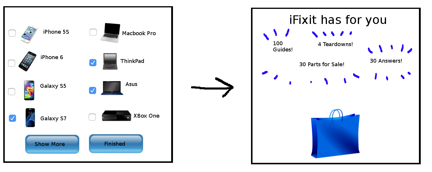
iFixit is an awesome website about repair. This idea is a tiny web app for new users to see what sort of content iFixit has. The user will put their phone, laptop, and other devices they own into a “Grab Bag”. Then the app will display repair guides and parts for sale that match those devices. Sounds simple enough.
Requirements
During an internship with iFixit, I got to travel to Makerfaire. I stood in front of a monitor, explaining the website to people. I want this webapp to offer that experience, without me as a developer having to stand there and do the explaining.
This gives me several requirements to consider
- Inviting – If this app was open on a monitor at a convention, I want it to look like it’s meant to be spontaneously used. It should look like a demo, not a product ordering page.
- Self-explanatory – There shouldn’t have to be a representative explaining what iFixit does. Though, I’m not against having light text direction inside the app.
- No typing – It would be nice if the app was mouse-based. People at conventions don’t always have both hands free. They might be carrying a drink or a swag bag.
- Quickness over Thoroughness – The demo should be succinct. It’s okay if the user doesn’t find their exact phone brand in the grab bag. The main iFixit web page already has a great hierarchy system for finding specific devices. I don’t want to attempt a rewrite of what already works.
Specification
First Draft

Here’s what I thought about the design.
- Checkboxes aren’t very interactive. This looks like a form.
- I really should put everything on the same screen. It might be harder to design though.
- Having to wait till the end to see the relevant statistics is no good.
- The sum total of guides doesn’t strike me as useful. The guides and parts have interesting titles and pictures that I’d like to show that.
Second Draft

Oh gosh, this ended up looking very confusing.
- My idea was to have the left side of the screen be devices orbiting around the logo, and the right side be content rising out of the grab bag for the user’s selected devices.
- It’s extremely cluttered. More white space is needed to make this divide more obvious.
- Maybe the grab bag should be on the top instead of bottom, with the repair guides falling down out of it?
- I’m not sure how to decide which devices to show, and likewise which repair guides to show. I was thinking of allowing the user to scroll through them. But if I’m worried about clutter, I don’t think I need more buttons.
Even so there are 3 features here that I like:
- The devices continuously floating onto the screen. That way the page could be left open to be used at a whim. There’s no need to reset the page after a user is done.
- The drag and drop for selecting devices. Who doesn’t like drag and drop?
- The repair guides folding out from the grab bag after the user drops a device into it. Confetti is optional.
I’m going to start coding, keeping in mind I want those features. Once I have a working prototype, I hope it’s more obvious how to rearrange things to reduce clutter.
Final Thoughts
Sharing this process helps me stay grounded in the scope of the project. Maybe I’ll even get some feedback before it’s completed. And best of all, the motivation and accountability to work quickly.


Seeing your process on this is absolutely fascinating! Thanks for sharing.